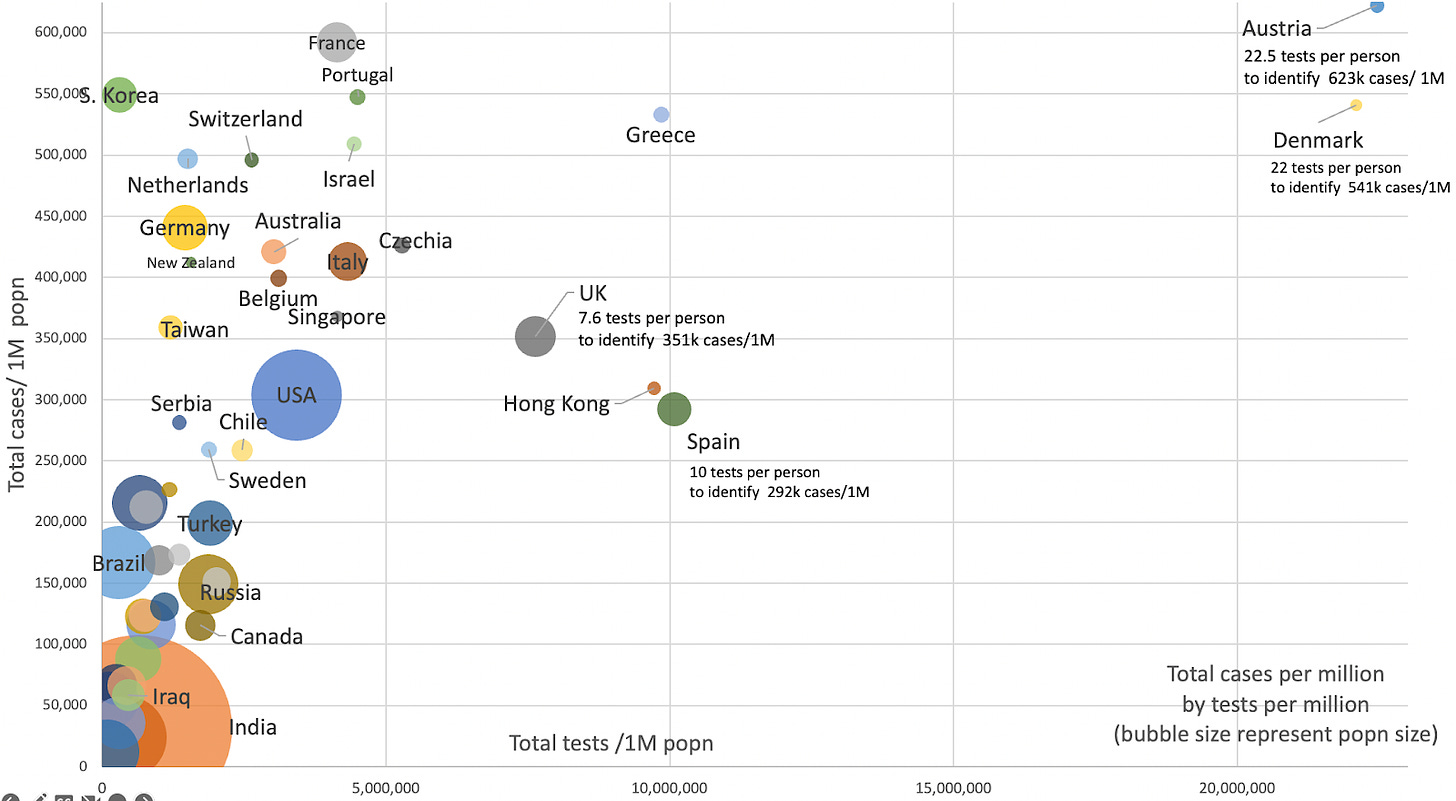
To assess the relationship between the number of tests to detect a case, we used Worldometer data to compare the total cases per million population to the tests used for the same population.
We plotted this with the country size representing the bubble size for the top 50 countries.
The plot shows the high test rates in Austria, Denmark, Hong Kong, Spa…


